Application forms
An application form is a web page that allows users to both view and modify data from one or multiple tables. Most user interaction with the application happens within these forms. Administrators can use the Form designer to create application forms, each typically designed to serve a specific use case.
Application forms (also called user forms) are different from system forms. System forms are mainly used by administrators to configure the application. However, some system forms — such as those used to run reports — may also be useful to regular users. Unlike application forms, system forms have a fixed layout and cannot be customized by administrators.
Form elements
A form consists of a title bar and an area with components such as panels and sections, where fields are displayed and organized. There are different types of sections, each with a particular design made to show records and fields in a specific way. It may contain:
-
The
 menu offers these settings:
-
Copy page link, useful to copy the URL of your current application form to the clipboard, so it can be pasted wherever you need (e-mail, notification, etc.).
-
Show history in tooltip, so every time you hover over any field on the form, a box will be displayed providing information on how the field has changed. To enable this setting, you must tick the Log changes checkbox in Data model editor’s Details tab for the table in question.
-
Show same record in other forms, to be able to view the current selected record while navigating through forms of the same data table. Not supported for Table section.
-
Open in form designer. Only available for administrators.
-
Toggle rule debug tool. Only available for administrators.
-
-
Panel. May have a title. It can be used as a base layer for sections.
-
Record selector. This is a list that normally shows the name of the current record, but it may display up to three fields together as identifiers (e.g., "Order 100 - Logistics - Approved", concatenated from the fields Record name, Department and Status, respectively). The user can navigate to records of the same table by using the
 arrows to go to the previous/next record, or by displaying the list and manually select other record. This list is divided in four parts:
-
The quick filter box, where a filter can be applied by typing the wished record name (and/or the text field(s) selected to be displayed in the Record selector, if available) and then push the Enter key or click on the icon, in order to show a resulting list. This filter is always case-insensitive. The characters ? and * may be used, where ? is translated as any one character, and * as any number of any characters; for instance, typing
A?9as filter would display records that start with A followed by any character and have 9 as their third character, i.e., like _A19, Ab9, A-9, but typingA*9, would display records that start with A and end with 9, i.e., like A19, Ab9, A-9, A0000009, ABCDE9. -
The Filter result bar, that shows the time when the list was last refreshed and the
 icon, used to reload the record list.
 -
The list of records available to the user, depending on the result of the filter (if applied) and on the access rights granted to the user’s role.
-
The Showing results bar, where the user clicks the right or left arrow at the end of this bar to navigate to the next of previous subset (the records are divided in subsets of 50 records in order to shorten the total list), respectively.
-
-
Record filter. Represented by the
 icon, is used to configure custom filters. This filter is usually case-sensitive (depending on the server settings for the current application). Note that this icon might show a drop-down next to it
  , meaning that there are saved filters that you can apply by clicking on them (i.e., quick access to saved filters). Clear the filter with the
  icon next to it.
 -
Section title. It can be left empty.
-
Action icons. Depending on the type of section and your rights on that section, you might have to hover over to display:
-
 (Quick Excel report) Create Excel file with available records in this section of the form. This is a useful and quick way to export to Excel only records and fields displayed at the moment of clicking this icon, e.g., hidden columns in a Table section would not be included in Excel. Note that records may be filtered by the Quick filter, Record filter or by the dependency on other section (i.e. parent section) before clicking on this icon.
The maximum number of rows that can be exported with this feature is 10,000.
The maximum number of columns is 150.
For larger reports, use Reports instead.
-
 Create new, to blank out the form (or add a new row, for Table sections) in order to enter data for a new record. The new record must be saved after this.
 -
 Save, to store data (either after creation or after any change made on the current record). Note that a window may pop up for you to choose a record group in case there are several available, and no default group is set by the administrator. In case Save is performed after changes on multiple records in a Table section, a confirmation window will pop up for you to review such changes, which can be optionally hidden.
 -
Revert, discards unsaved changes (available for offline forms).
-
Save as new, to create a new record based on the current selected record (i.e., a copy of a record).
-
 Save as new, to create a new record based on the current selected record (i.e., a copy of a record).
 -
 Delete, to permanently remove the current selected record.
 -
Arrows to navigate to the previous/next record in the Multi detail section.
-
-
Menu per column. For Table section, when hovering over a column heading, the
 icon is shown; click it to displayed a context menu with the several options to filter, autosize and pin columns, and to hide/show columns.
 -
Components. Items such as charts, lines, icons, links and media might be present in the application form, inside or outside sections. Note that:
-
Chart components include a control bar with icons to perform actions.
-
For pictures uploaded to the form via the Media component, the Image editor is available to, for example, draw a circle of a certain color to highlight an area. This is done by clicking on the pencil icon, which displays a screen with tools to rotate and/or draw on the picture. Once saved, the final image will overwrite the original one, but as a .jpg file. Note that there can be a "template" image, i.e., an image available on the form by default, that can be of course edited in the same way described above.
-
-
Offline mode. Your form might be enabled for offline access.
To display a record, either select it directly in the Record selector drop-down or use the Record filter to find it, and then, select it.
To create a record, click the icon (that appears by hovering over the form). Enter the record name (in case is not autocreated or the default record name like "New record 1" is not desired) and enter data in, at least, all mandatory fields (i.e., required fields). A pop-up window may be displayed requesting a record group for the new record, in case there is no default group (configured by the administrator) for this. Finally, save with the icon.
To save a record as new, edit the Record name of the selected record (so it is unique) and click the icon.
To edit a record, make sure the correct record is selected and displayed in the form. Save in the proper section of the form after any change made on the record.
|
Note that a "*" mark may appear next to record names listed in the selector of a Detail section if such records have been edited without being saved before navigating between other records. This is due to the Save action only saves the current displayed record, however the form gives the opportunity to easily identify those modified records by adding the "*" indicator in order to select them and save them. Dismissing the form will lead to lose unsaved data on those records. |
To delete a record, make sure the correct record is selected and displayed in the form. Click the icon (that appears by hovering over the form). This action cannot be undone.
|
IS Tools forms cannot be resized by the user. Large forms and long navigation menus can be scrolled by using the scroll bars automatically provided by the web browser. In general, it is a good idea to maximize the browser’s window in order to occupy the whole screen area. |
Section types
Detail section
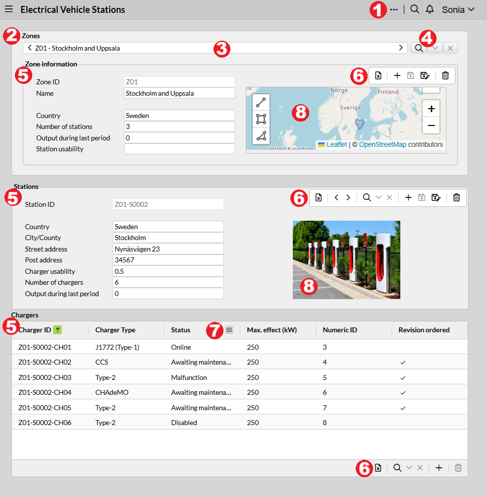
Displays fields of a selected record of a table, i.e., one selected record is displayed at a time, amongst many in the Record selector at the top of this section.Control icons (such as Create new, Save as new, etc.) are shown at the top right corner when hovering over the section.The Record filter is available.In the image above, the section called "Zone information" is a Detail section.
Table section
Multiple records of a table and their fields are displayed as rows and columns.Mainly used to have an overview of the records of a table.Can also be used to select a record to be displayed on another section type (for instance, to edit it or to provide more information about it).In the image above, the section called "Chargers" is a Table section.
Save is usually done automatically after editing a cell and hitting Enter or focusing away.Otherwise, a Save icon is available to perform this.
The confirmation that pops up after saving multiple records may be enabled/disabled in User settings.
Columns can be sorted by clicking on their headings. To sort multiple columns, hold down the Shift key while you click on the desired headings. You can also drag and drop columns to change their position.
All customization you make, will be displayed next time just as you left it. Click on Reset columns on the icon if you want to start with the original settings.
Action icons (such as Create new, Save, Delete, etc.) are shown at the bottom bar.
|
Copy-paste values: Cells in the Table section can be selected with the mouse (
|
|
For a proper functioning of the copy-paste feature from Table section to Excel and vice versa, make sure to enable the "Clipboard" permission found by clicking the icon next to the URL address bar of your Internet browser. |
|
Multiple rows in the Table section can be selected and deleted. Use Once the deletion icon is clicked, a dialog box will pop up so the deletion of all/specific rows in orange (or another color set by the application’s theme) can be confirmed. Note that the row in gray is the active record. |
Multi-detail section
Similar to a Detail section, it shows one record and its fields at a time, with the difference that navigation of records is achived by clicking on the arrows shown at the top right corner when hovering over the section, since it does not include the Record selector. Mainly used to show records of a child table, e.g., records displayed in a submitted form that depend on the records in the section above. In the image above, the section called "Stations" is a Multi-detail section.
Keyboard shortcuts for Forms
| Key(s)* | Action |
|---|---|
|
Move forward through fields/cells. |
|
Move backward through fields/cells. |
|
Toggle edit mode (Table section). |
|
Exit edit mode (Table section). |
|
Move to neighbor cell (Table section). |
|
Select active cell, move to and select neighbor cell (Table section). |
|
Select current row (Table section). |
|
Select multiple rows, from the first row selected to the current position where Shift+Spacebar was hit (Table section). |
|
Save all records with changes (Table section). |
|
To find and go to a section in the form. |
|
To go through sections in the form. |
|
Save changes for the record selected. |
|
New record. |
|
Delete record. |
|
Save all sections in the form (tip: this shortcut is especially useful with the Repeater component). |
*Some of these keys might be prevented depending on the type of browser, or by the configuration properties.