| Component | Description | Configuration | Remarks | Example |
|---|---|---|---|---|
Media |
A picture from the web or from a File field. A video from a File field. A white background for digital signing. |
Has multiple properties to resize the image, to preview PDF documents, to have a full image cover, etc. For images and text files clicked on this component, a preview will pop up with its content. |
|
|
An icon to save records, to open a form, or to run a report, among other actions. |
Use the Multiple actions can be set via the Run on click property. Also, style can be set via Behavior. In case this component uses Table data, but is placed outside the section, the property |
Record actions are a handful alternative instead of having the action icons at the top right corner of the form. Note that these actions are binded to the rights the user is granted to. Be aware that an Icon configured to do actions on a Table section will only work for the selected record. |
|
|
Link |
A link text that will take you to another form within the application, to a website or to run a report, among other actions. |
In case this component uses Table data, but is placed outside the section, the property |
Same remarks for Icon. Additionally, Link can be dropped as a column in Table sections. Link will not be displayed to users who do not have rights granted on the destination form. |
|
Text to have on the form as a legend, i.e., a static label that is not bounded to any field. May be used as frame to stream YouTube videos on Forms. |
Ways to use it: 1) Enter a Caption for this component. Style it with Properties, or double-click it to style it with Markdown, in combination with the Display as formatted text property, e.g., 2) Set the caption and style with Behavior, e.g. 3) Embed a YouTube video with Markdown in combination with the Display as formatted text property, e.g., |
|
||
Rectangle |
Useful to frame or highlight an area within the form, e.g., to draw a section within a real section. |
Optionally, edit its Style. |
Note that this component may have custom behavior. |
|
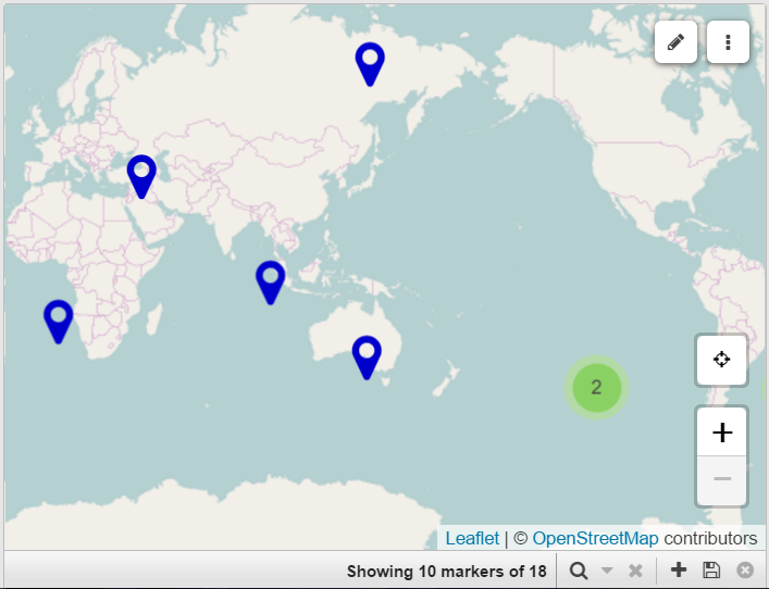
Geographic coordinates can be marked on this mapping service to store and identify the location referred by a record. |
|
|||
Map layer |
Additional layers of location markers can be overlaid onto a Map component. |
|
||
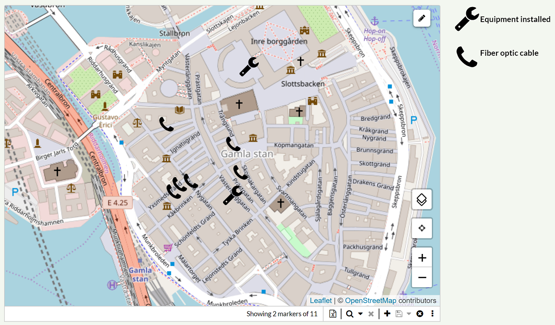
Map layer editor |
A layer overlaid onto a Map component that includes tools to draw areas or edit existing ones. |
A prerequisite to use this component is to have a Note field to store Geojson information. Once overlaid onto a Map, select the proper Datasource, Limited by (may be the Selector or any section), Limitation field and Geojson field. Do not set any property to the Map. |
|
|
Calendar |
A full-size calendar with day, week or month-view. |
Hover over the appointments (i.e., records) to display a tooltip with details. The color of the event is defined by the Theme (unless Style rules are set to the Calendar to customize colors). |
|
|
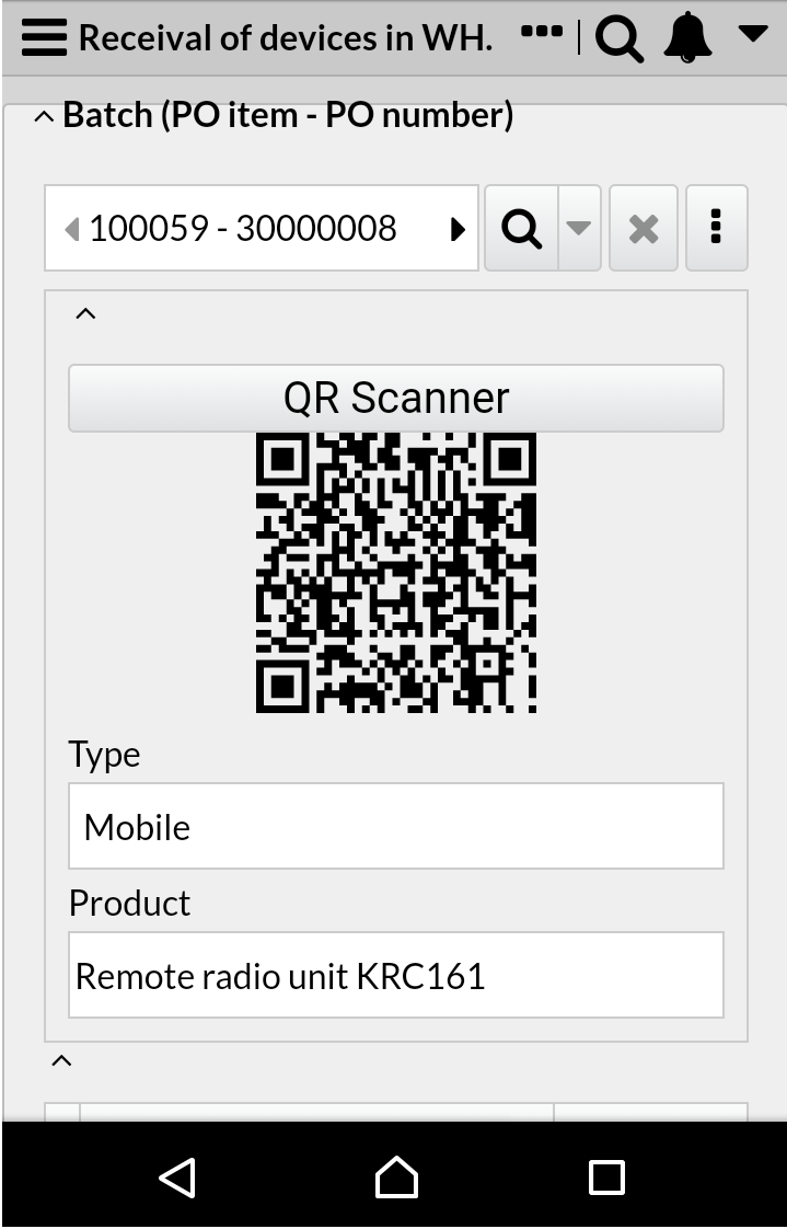
This component can integrate an icon and text in its design, useful to run reports, save records, open a form, scan a QR-code, take a screenshot to Maps, among other actions. |
You may set an Icon together with a Note that this component has an additional action: QR-Scanner, in combination with the QR-code component. In case this component uses Table data, but is placed outside the section, the property Multiple actions can be set via the Run on click property. |
Be aware that a Button configured to do actions on a Table section will only work for the selected record. |
|
|
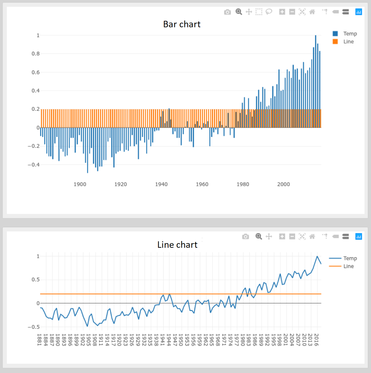
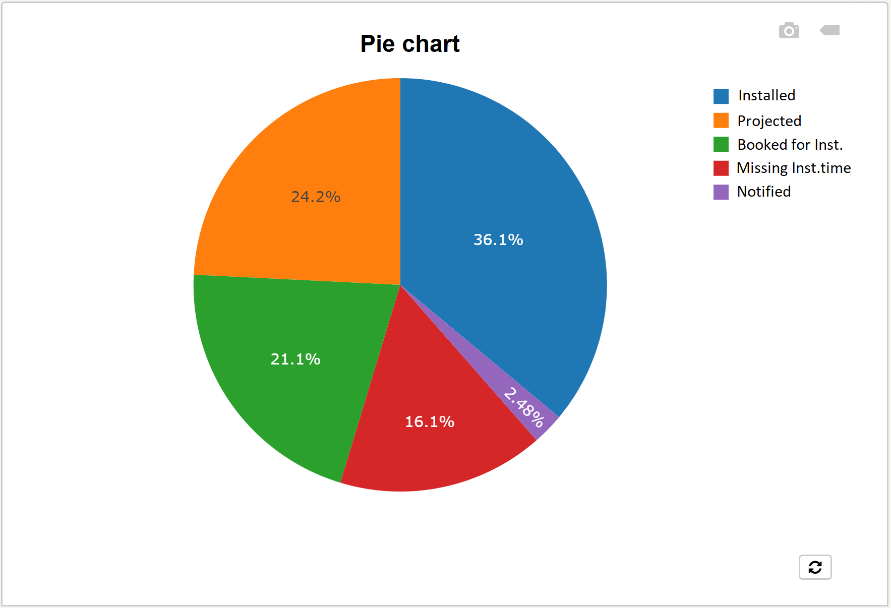
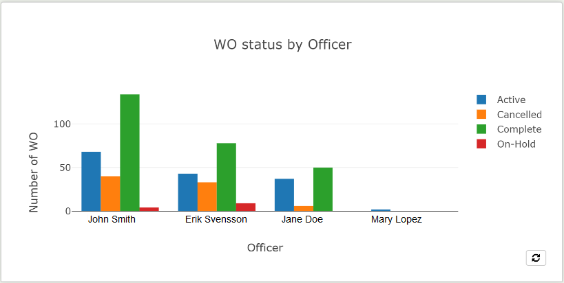
Chart |
There are three types of charts: Bar , Line , and Pie . |
Clicking a legend hides the respective series, while double-click shows only that one. A tool bar is displayed when hovering over the top of the chart, that offers the possibility to download the chart as a PNG file and show closest data for Pie charts, and much more for Line and Bar charts. For any chart where the x-axis field is Date, you may use the Date range selector to be able to filter by periods of time. |
|
|
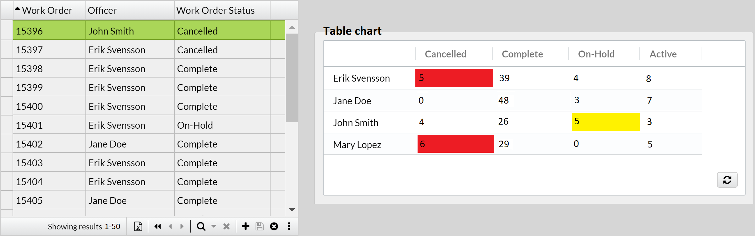
IQL Chart |
An advanced way to configure this component; for example, you can summarize the data of an extensive table to render it as bars, lines or table, i.e., like a pivot chart. |
For the Table type chart, the colors of the cells may be customized in combination with the Behavior property of the Count (or Sum, etc.) placed on the y-axis. Also, it is possible to pin the first column of the table. |
|
|
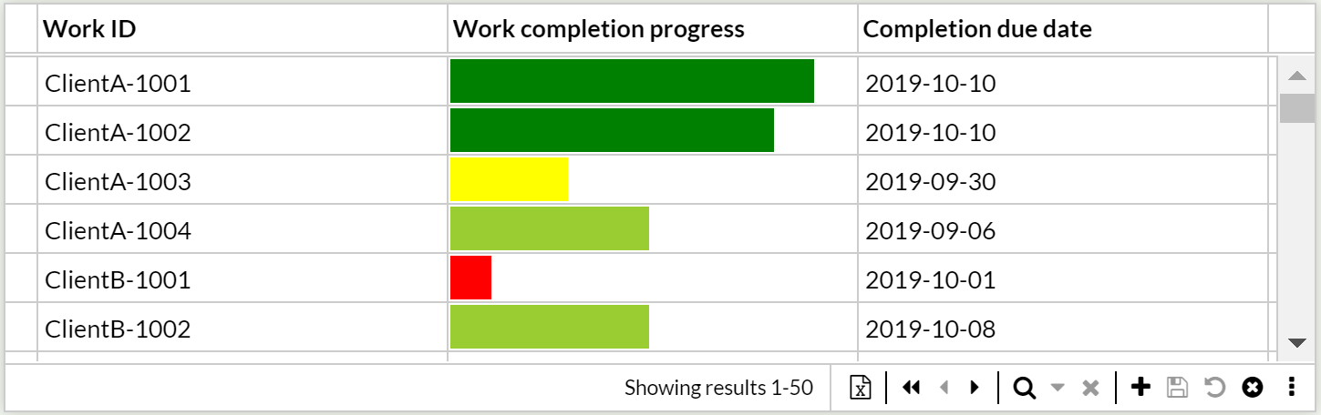
Ideal to graphically show the progress of a Number field based on a range, in the shape of a horizontal bar. |
Set its Datasource and Range. You may set colors depending on the range with rules. |
Hover over the bar to display its value. |
|
|
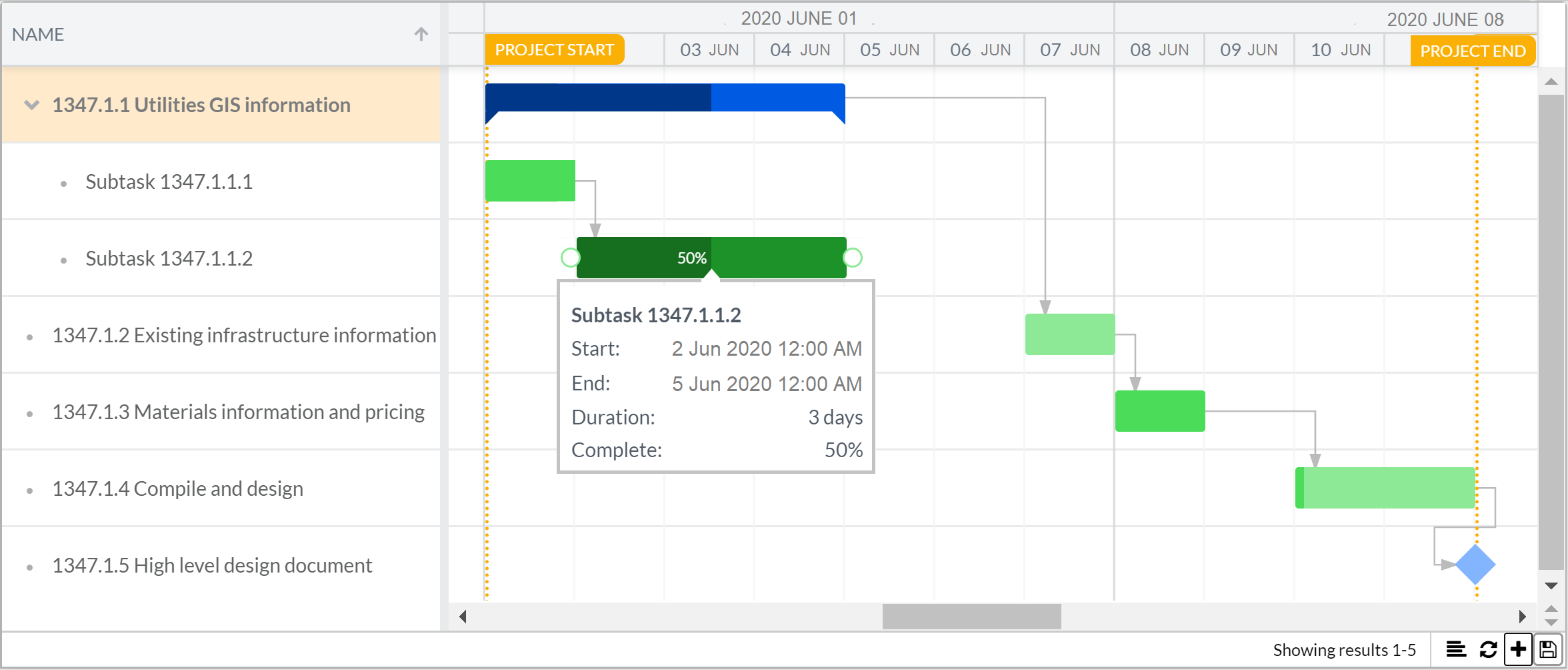
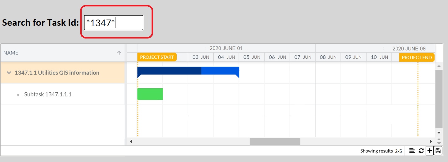
Gantt chart |
Helps you schedule your project tasks and track the progress over time. |
Click on Create new icon to add a Task. Double-click the Task to quickly rename it. Read about more features here. |
|
|
Use these optical labels to track and store information about goods or items, or for storing URLs of webpages, marketing, etc. |
Set its Datasource (must be Number or Text), Select the Bar-type and the Code format. You may change other properties. Optionally, add a Button component with Action QR-Scanner to your form to scan the code directly from your smartphone. In this case, make sure the QR code Datasource and the QR-Scanner field match (must be Text). |
Click the QR-Scanner button from a mobile device. Barcode scanning is an extended functionality. Please contact you IS Tools sales representant for a quote. Use the Scanner feature to write QR and Barcode values into a Search box to look for records in sections. |
|
|
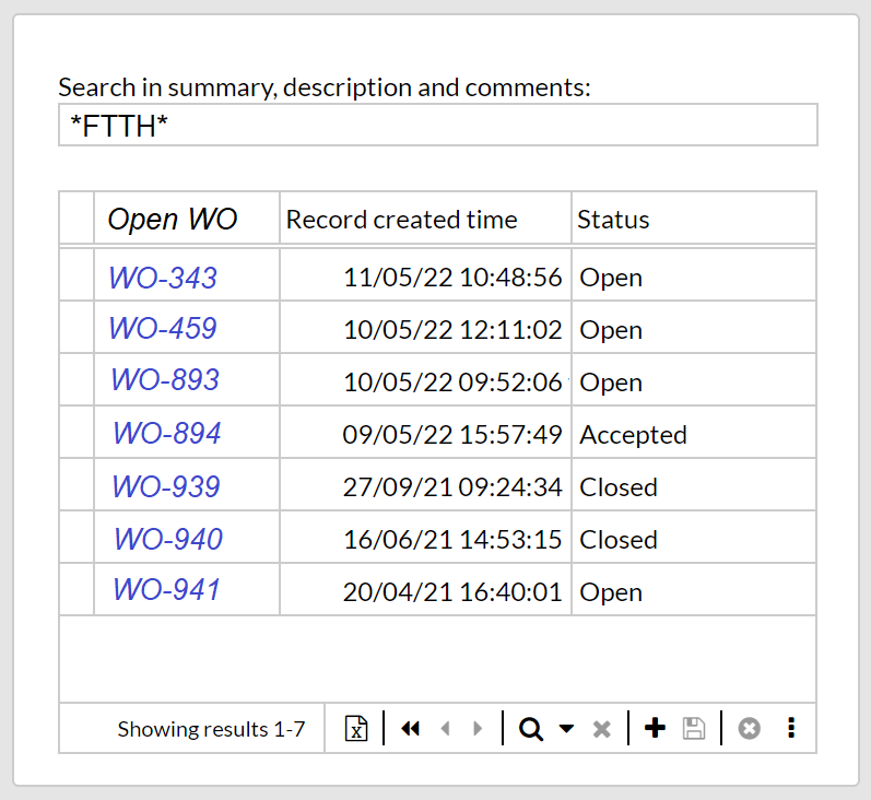
It’s a field component, but with no table associated to it, used as input box to search data. |
From the Component bar, select and drag-and-drop onto the canvas a Text, Number, Date, Date time or Checkbox field. In the Properties panel, type Param1 (or any word you wish) as Datasource. Select the Record selector or the section, and click on Filter: Configure property. In the IQL editor type for example: You may want to add a Label component, e.g., Search for Task Id to the left of the Search box so it’s clear for users the purpose of it.
|
Can also search QR and Barcode values obtained via Button component. |
|