Form designer
Application configuration > Form designer
The Form designer allows the administrator to configure application forms.
There are two different methods to access the Form designer. First one is by clicking the Form designer entry in the Navigation menu. The second approach is only possible when forms already are created in the application. In this case click the Open in form designer entry in the  menu, next to the form title bar.
| Once the editor is opened, consider collapsing the navigation menu, in order to have a wider area for the form configuration. |
Walkthrough of the environment
The Form designer consists of the six following elements:
Blocks
The following blocks are dynamic and can be placed according to your own preference.
Form rules
An editor where to use IQL for setting up rules and advanced filters in the form.
Click on the  icon to show change information by line, or click on the
  icon to show history to control the code version of such changes. The retention period of these logs is unlimited. Request this IQL versioning functionality to our support team if is not already enabled for your application.
Besides the examples of IQL described along this topic, read also IQL in Forms.
Create a form with a section
Before beginning to create a form, make sure that the current data model contains the tables and fields you wish to display in the new form.
-
Form. Click on the
 icon at the top bar and then click on New. Click on the canvas area (where the "Form is empty" legend is) to list the properties of the form under the Properties area, and enter the Caption, which will be the title of the form. So far, the form is created, but empty.
 -
Panel. Optional step. Select the Panel icon under Components, and place it onto the empty area.
Note that any component can be added directly on the canvas area, i.e. without a panel as base; however, it’s recommended adding one for a better appearance and organization of those components (see a picture of the form’s item here).
-
Section. Select the desired section icon, depending on the design you need:
-
Detail, displays fields of a single record, selected via the Record selector (which includes the Record filter) or Table, Gantt or Calendar sections. For this, select the Selector or section from Components, and place it onto the panel or canvas. Then, do the same with the Detail icon. Under Properties of the Detail and the Selector or section, set the Datasource (i.e., the table containing the data to be displayed). Then for the Detail section, set Limited by to "Selector" or given section (i.e., to relate the selected record with its data in fields placed on the Detail section). See an example of a rendered form with a Detail here.
You may also limit by another section. Read more here.
-
Table, displays multiple records from the same table and their fields and rows and columns (note that Label and Link components can also be columns). Read more information about features of a rendered Table section here. To add this section, select the Table icon, and draw it onto a panel or canvas. Then, under Properties, set Datasource. Optionally, set other properties like:
-
Toolbar buttons placement (i.e., the icons to save, delete, add, etc.) can be aligned to the left or right to better suit your design.
-
Summary row aggregation can be set per column.
The
Summary row aggregationproperty may impact application performance due to the initial and continuous evaluation required for summarization, which can cause forms to take longer to load and every time a filter is applied. Use it only when necessary. -
You can apply Style to headers and data separately, per column or for the whole section.
-
Tick the Force apply filter to display the "Apply filter" button on Column filters. Without this button, filters are automatically applied as soon as you enter a string, number or date, or click an option for drop-downs and checkboxes.
-
Tick the Selection checkboxes property to add a column where the user can select multiple records for later use as an array.
-
-
Multi detail, similar to Detail section where fields of a single record can be displayed, with the difference that navigation through records is done in the upper right part of the section (if enabled). Add this section by selecting the Multi detail icon, then place it onto the panel or canvas, finally, under Properties, set the Datasource the appropriate table.
Hide the navigation arrows in the Multi detail section for cases when you know only one record will be displayed.
-
-
Repeater, a detail section that multiplies itself as many times as records exist, providing a quick overview of your data with all the design that a Detail section stands; e.g., use it to display a list of products or services. To add this section, select the Repeater icon, and place it onto the panel or canvas, then, under Properties, set the Datasource the appropriate table. Note that the default Direction for how this section is multiplied is Vertical, set to 1 Column, but you can change it to Horizontal Direction to set fixed Rows instead. Toolbar buttons placement (to save, delete, add, etc.) can be aligned to the left or right to better suit your design.
|
To have multiple sections designed as a "tabbed form" (i.e., controlled by buttons used as tabs), then use the Layers feature. |
-
Fields. Note that when selecting a section, fields (both system and user defined) are listed under the Fields area. Place the needed fields onto the desired position within the section (multiple fields can be added at once by using the Control or Shift keys).
To be able to quickly find certain fields, use the filter icon of the Fields area. Note that the filter is case insensitive and does not need wildcards (i.e., * and ?).
Alternatively, you may add fields from the Components area (look for the ones in blue), where the Datasource field must be specified. Note that the field is added without a label.
Be aware that, in rendered forms, the user will be able to move from one field to another by hitting the Tab key, in the order the fields were added to the section. If you wish to establish the default order so that Tab works from top-left to bottom-right, then right-click on the section to pop up a context menu, and click on Reset tab order. If you prefer a specific order, use the Index property (the number next to Parent of the selected field or component).
Add the Record group field to a section meant to be used on mobile mode, in case there are many record groups defined and no Default record group selected in Data model editor (or selected, but with no rights).
-
There is a lot that can be done in the Form designer, read more about it here.
-
Save the form.
Note that new forms are automatically added as a menu item into the GENERAL accordion of the navigation menu, with access rights to the ADMIN and USER roles. To edit access rights for these or other roles, use Form rights.
As an alternative to creating new forms from scratch, you may use the "Make a copy" option found within the
icon, to save your current form as a new one instead.In case you need to replace the original form with a copy where you saved changes, use then the "Replace another form" option. Be aware that this option is a full replacement, taking the original form’s place in the menu, rights granted, and URL.
Video tutorial
This step-by-step tutorial will cover the basics of creating a user form with form designer:
Link to the Data Model Configuration Bundle
Add a component (e.g. Media, Map, Calendar, Button, Chart, etc.)
Media
The media component may be a picture from the web, or a picture or video from a File field.
Example
|
|
|
Right-click on the rendered Media component, and click "Copy link address". Example of the link obtained: Then you can share the link with members of the application (e.g., via mail, notification or SMS) to automatically download the file, provided they have the appropriate access rights. |
Button
The button component lets customised actions to be run when it’s clicked.
Configuration
Under properties, set the Target section and optionally an icon and caption.
Under Form rules set the Behavior and Run on click, e.g.,
set :backgroundcolor = 'green'call save()|
For tables, actions will only work for the selected record. |
Example
|
Link
A link text that will take you to another form within the application, to a website or to run a report, among other actions.
|
In case this component uses Table data, but is placed outside the section, the property |
Example
|
Label
Text to have on the form as a legend, as a column in Table section with an IQL caption, or as a frame for embedded YouTube videos.
Example
|
Rectangle
The Rectangle component is used for highlighting an area of the form.
Custom the rectangle’s color, transparency and behavior as wished.
|
The Rectangle component is not rendered in mobile mode. |
Map
The map component is a map where coordinates can be marked to identify the location referred by a record. Toolbar buttons placement (to save, delete, add, etc.) can be aligned to the left or right to better suit your design.
Example
|
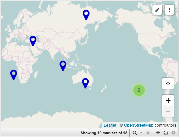
Map layer
Additional layers of location markers can be overlaid onto a Map component. It’s makes it possible to display data from a GeoJson field.
Map layer editor
A layer overlaid onto a Map component that includes tools to draw areas or edit existing ones. It’s makes it possible to store GeoJson data in a note field.
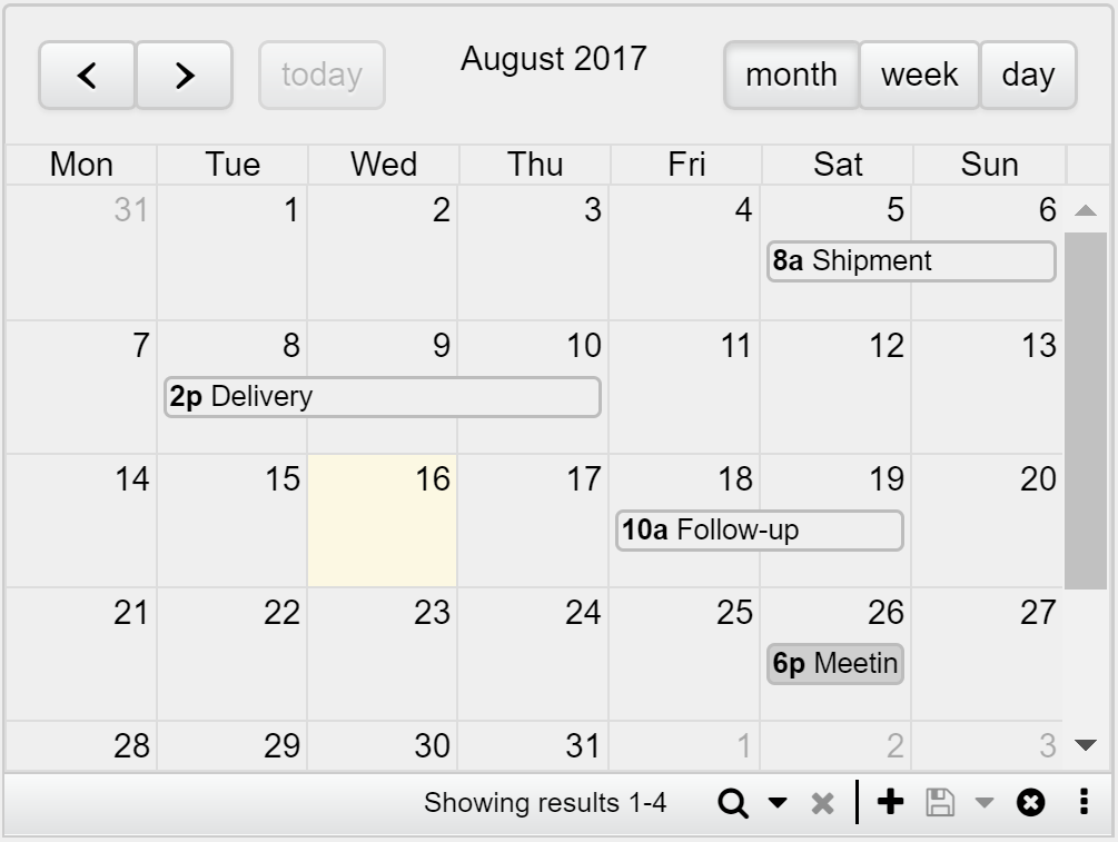
Calendar
The calendar component is a full-size calendar with day, week or month-view. Toolbar buttons placement (to save, delete, add, etc.) can be aligned to the left or right to better suit your design.
Example
|
Chart
The chart component can display three different types of charts: Bar, Line and Pie charts. The chart can then be saved as a PNG with a simple click.
|
Clicking a legend hides the respective series, while double-click shows only that one. |
Example
|
|
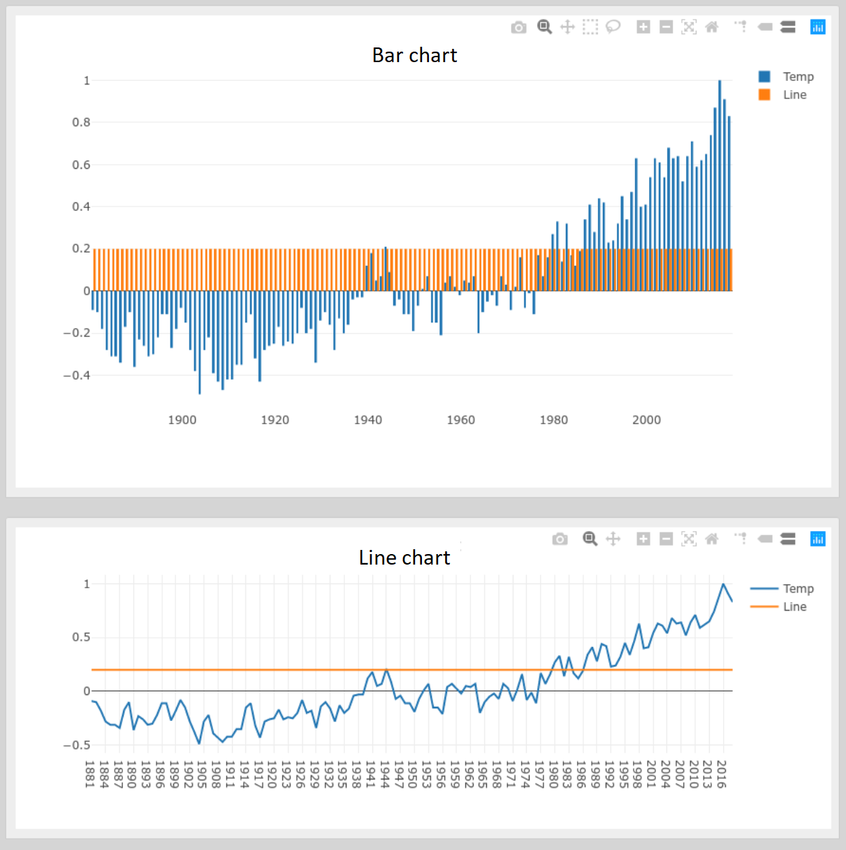
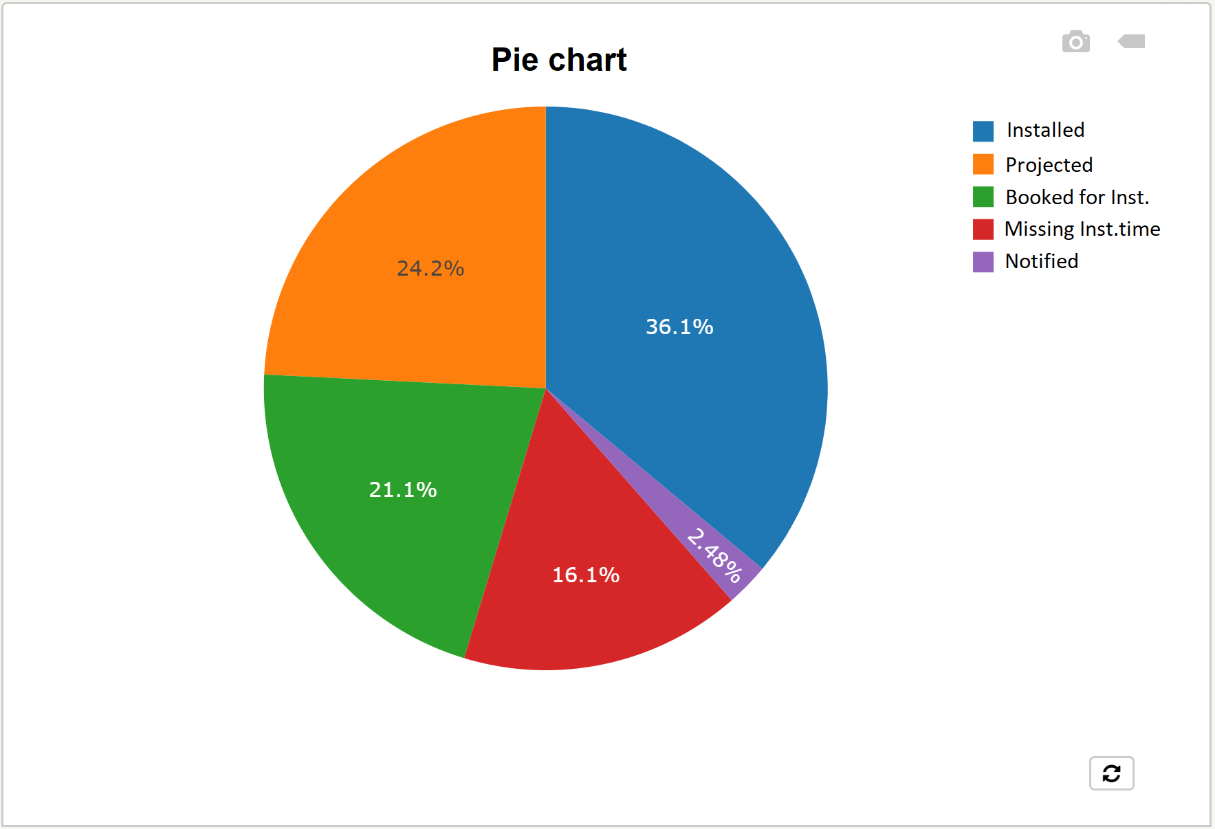
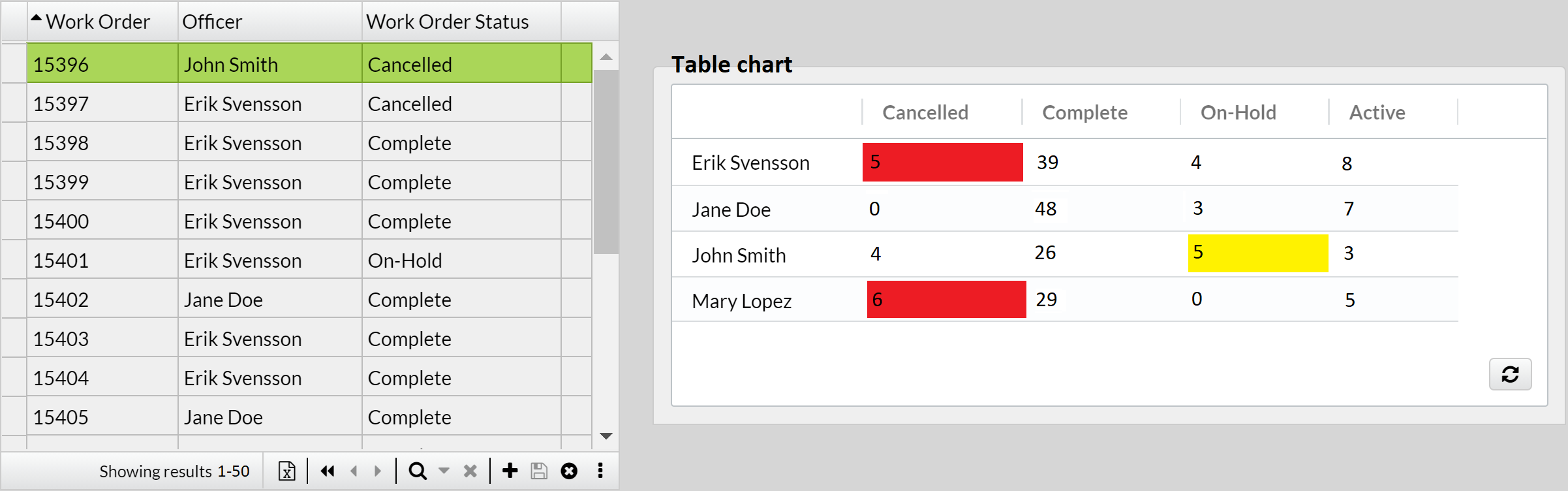
IQL Chart
A more advanced way to configure a chart with IQL. It gives further options that is not possible in a regular chart.
Example
|
|
Some general properties are:
-
Show labels. This will display the original name of the field placed as x-axis at the bottom of the chart. In the image above, "Officer".
-
X-axis label. To custom the original name of the field placed as x-axis at the bottom of the chart.
-
Y-axis label. To add a name on the left side of the chart.
-
Max rows. The number of elements you want to appear on the x-axis for Line and Bar charts, or slices in Pie chart, or rows in Table chart, e.g. 3 officers.
-
Use date range selector. See an example of how it is used in Line chart. Can also be used with Bar chart. Must be used together with "X-axis type: Time series" and "Date range selector interval" properties.
Meter
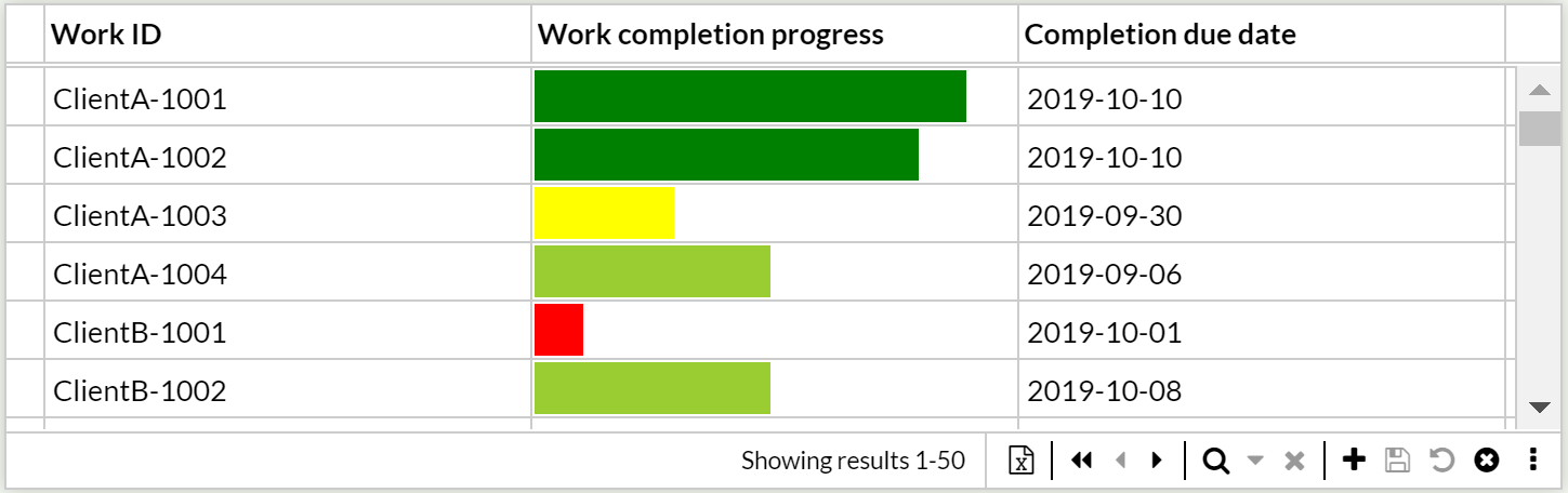
The meter component is a tool to display a number field as a partion of an interval, e.g., exceptional for displaying progress.
|
Set the color of the bar depending on the value. E.g., |
|
Hoovering over the bar displays the exact value. |
Example
|
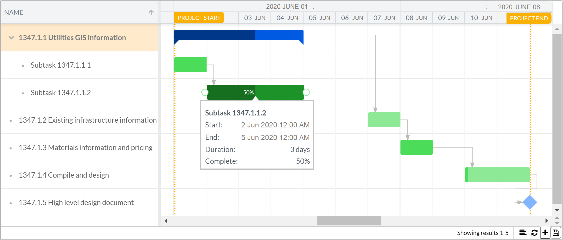
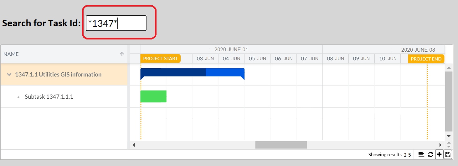
Gantt chart
The Gantt chart component helps to schedule project tasks and tracks progress over time. Read more about the Gantt chart here.
Example
|
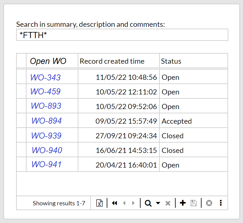
Search box
The search box is an input box to search data. It is configured in the following steps.
-
Add an input field to the canvas, e.g., Text or Number field.
-
Under Properties, set Datasource to a desired variable, e.g.,
@searchForNames.
-
-
Add a Section that displays records, e.g., a Table or a Repeater section.
-
Under Form rules, set the filter to display the records that matches the variable. E.g.,
Name contains @SearchForNames
-
A simple search box is thereby made.
Example
|
|
Set a fixed filter to a section
It can be very useful to have a section pre-filtered by conditions set by the administrator, so regular users who access the application form would see a limited record list based on such conditions, without being able to modify them, e.g., let’s say a subcontractor that can only see a fixed list of own pending tasks. This type of filter differs from the filter set in the Record filter (Show filter) button in that the latter one is customized and editable by the user on the finished form. Also, think of the Record filter (Show filter) button as a tool to find specific records, while the fixed filter works as a tool to permanently shorten the list of records shown to the users.
|
Fixed filters are designed to facilitate and support workflows. Should the use case involve separation of information, Record groups rights is the secure way to support it since the information access requirements are enforced regardless of forms and/or filters. Service accounts access the information using the API, where no forms or form filters exist. |
To set a fixed filter, select the wished section, Selector or Relation field. Now there’s two different methods of adding the filter. For advanced filters, open the Form rules block and write the filter with IQL. The other option is to click on the Filter: Configure… property and then using the GUI that pops up to add the filter.
Using the Form rules block enables the Show change information by line and the Show history functions that helps you keep track of changes in your filters.
|
Using IQL makes it easier to edit the filter inside the Form rules block. Your filter can be converted to an editable IQL script by pressing Convert to advanced filter button in the GUI. |
|
Be aware that the fixed filter will limit both the record list of the section where it has been configured and the record list of those sections depending on it. On the contrary, sections having no dependency on a fixed-filtered section and no fixed filter themselves, will show a full list of records. There can also be the case that a section’s record list is limited first by its previous section’s fixed filter, and then by its own fixed filter. |
|
Apply a fixed filter to set your form to a create-only mode. |
Example
Age > 50 and "Start date" < '2000-01-01'
A filter that shows people of age larger than 50 and a start date earlier than the first of january 2000.
Set custom behavior for components
Use the Behavior property to make the selected component change in a special way, depending on your business logic flow; e.g., a Note field that behaves hidden until a Checkbox it ticked, or the bar of a Chart turns red if it represents a low value. The supported components are: Button, Icon, Rectangle, Label, and all type of fields except for Multi-value and Relation.
To configure the behavior, select the component that you want to configure. Then open the Form rules block and use IQL to set the wanted behavior. To see examples and syntax, go here.
|
The usage of Behavior may impact on the performance of the application due to the constant evaluation made on the form. |
Display field values in the selector / Relation fields on sections
The selector is used to select which of the currently existing records that should be displayed in an certain section. In order to better identify the records to application users, it is possible to display field values in the selector instead of only the record name. For instance, a list of Contact records may identify each record by an automatically created number. It is then reasonable to display, in addition to this number, the full personal name of the contact.
To configure this, hover over the Record selector of the Detail section. Use its Display fields property, which displays a list of available fields that can be marked (up to 3 fields).
|
Note that field values can also be displayed on Relation fields, following the same instructions described above. |
|
In case the added fields are Text, this feature will enable up to three quick filter boxes in the navigation drop-down of the Record selector. |
Limit by
To ensure that users of a form only has to browse trough relevant data, the Limit by function should be used. It hides the irrelevant records depending on the record selected ihn another section.
E.g., a large construction company wants to have a form where it’s possible to see what worksite vehicles is on each worksite. There will then be a table for Worksites and a table for Worksite vehicles, in the Worksite vehicle table there will be a relation field that holds the value of the Current worksite. In the form, a Selector section is added with Worksites as source and a Repeater section is added with Worksite vehicles as source. The company has a vast number of vehicles and therefor browsing through all would be highly time-consuming. Only displaying the vehicles that currently is located at the chosen worksite in the selector is done in two easy steps.
-
Under Properties, set Limited by to the selector section.
-
Under Properties, set Limitation field to the current worksite Relation field or, under Form rules set the Filter using @limitByValue, e.g.,
Filter@limitByValue = "Current worksite"
|
It is possible to limit by all sections where a single record can be chosen, e.g., Selector, Detail and Tale. |
Find in form
Use this feature to search for fields and variables in forms. Once found, double-click the resulting entry to be taken directly to the component in question.
Edit a form
Click on the icon at the top toolbar, select the form and double-click to open it. The procedure for editing is similar to the one discussed on the topic for creating new forms, and their different sections.
|
To quickly find a form, use the filters in the table of existing forms. |
|
As an alternative to editing live forms which changes are applied and available to users immediately, you may want to create a copy first to implement the proper changes, test it, and then display it to users. For that, click on the Be aware that this option is a full replacement, taking the original form’s place in the menu, rights granted, and URL. |
Translate a form
All items in the form that have a label, e.g., labels that belong to fields and links components, and even the form name and its panels' and sections' titles, can be translated to the permitted languages set to the current application. For this, select the wished item and, under Properties, click on the  icon in order to choose the language. Then, enter the Caption, Tooltip, etc.
|
Delete a form
Click on the icon at the top toolbar, select one or many forms (listed by name) and click on Delete.
|
The action of deleting a form cannot be undone. The item in the navigation menu linked to this form is also removed. |
Copy and paste components in a form or between forms
Suppose that you copy and paste a section designed with colored components and standard IQL queries (with no dependency constraint). Then simply press Ctrl+C and then Ctrl+V on the desired form, without having to start from scratch every time.
For copying an entire form, the easiest and fastest way is to use the top bar. Simply click Options → Make a copy.
If you want to move a section within a panel to another one or onto the canvas, or vice versa, then you can use the Parent property, where you can edit the dependency constraint, very useful to also save time when redesigning an existing form.