Form designer layout
A form is built from containers — the form itself, plus sections, panels and groups — and each container holds components. Layout comes down to two decisions: how a container arranges the components inside it (Child layout), and how each of those components decides its own size (Layout-Dimensions). When the two agree, the form adapts gracefully to any screen it is opened on.
Both are found in the Properties panel: select a container to set how it arranges its contents, or select a component to set how big it is.
| Please be aware that this layout feature is an ongoing development effort spanning multiple releases. Because we are releasing it early to collect user feedback, future updates may alter or impact your current configurations. We strongly recommend against deploying this functionality for business-critical features right now. We do, however, invite you to explore the tool and provide feedback to help shape its future. |
Form root - The main container
Layout - Dimensions
Dimensions define the canvas size for your form elements. Only set specific dimensions if you plan to use Fixed edges; otherwise, leave the width and height at 0 (the default for new forms) and pair it with a Stack vertically or Stack horizontally child layout to make it a responsive form.
Child layout
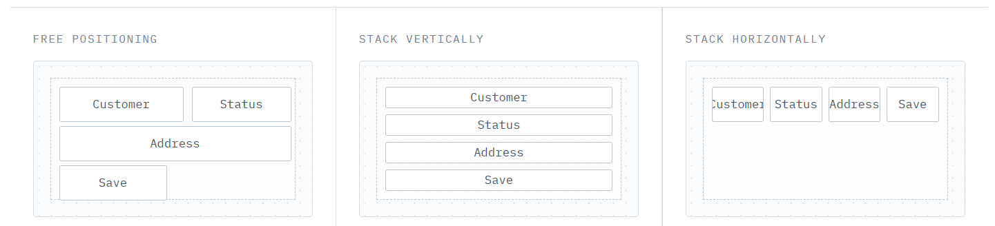
Choose a Layout type:
-
Free positioning: It is the classic behavior. Allows you to place each component wherever you want, and it stays there, which means it does not adapt to smaller screens on its own.
-
Stack vertically: Ideal for phones and tablets, where vertical scrolling is expected. Automatically places components one after another, downwards. Drag a component to move it up or down in the order. See the Form vertical layout example.
-
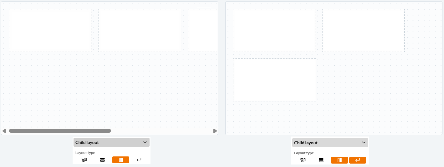
Stack horizontally: Ideal for forms designed to arrange components along the width of the screen. Automatically places components side by side, rightwards. Drag a component to move it left or right in the order. See the Form horizontal layout example.
-
Wrap rows: Available for Stack horizontally layout only. When the components no longer fit on one line, they continue on a new row instead of being squeezed together.
-
Align rows: Available for Wrap rows only. Decides how the rows are distributed once there is more than one: gathered at the top, centred, at the bottom, stretched to fill the height, or split with the free space between them.
-
-
Alignment, padding, gap
-
Alignment: A grid of nine positions that places the components as a block within the container.
Alignment only has an effect where there is spare space to distribute. If everything in the container is set to Fill, the components already occupy the whole container and alignment will not be useful. -
Padding: The space between the edge of the container and the components inside it. Can be set per side.
-
Gap: The space between the components, in pixels. A single value keeps the whole container evenly spaced, which is far easier to maintain than nudging each component into place.
Other containers
Panel, Detail, Multi detail and Repeater are containers that support both Layout-Dimensions and Child layout configurations.
Layout - Dimensions
In a Free positioning form root, you also get Position and Fixed edges.
In a Stack vertically or Stack horizontally form root, the width and the height each get a choice of Fixed, Hug or Fill.
-
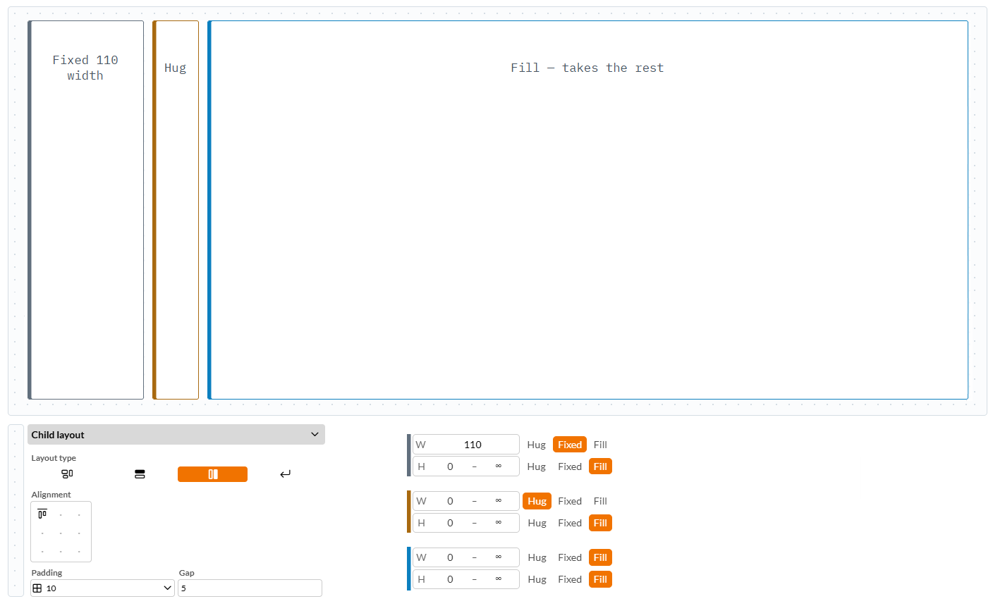
Fixed: A custom size in pixels.
-
Hug: Takes the size of its own contents and follows along as those contents change. For example, a Detail section with its height set to will be exactly as tall as the fields inside it.
A hugging width will still give way when space runs short, so that a row of components never runs off the side of the screen. A hugging height will not: the form grows taller and the user scrolls, which is the behaviour people expect. -
Fill: Stretches to take the space that is left over. For example, a Detail section with its width set to Fill inside a vertical stack form root will expand to the full width of the screen.
Double-click a handle to switch that dimension straight to Fill and clear its bounds. Double-clicking the corner does both dimensions at once. It is the fastest way to say “just fill the space”.
As soon as a dimension is set to Hug or Fill, the pixel box is replaced by two smaller boxes: a minimum and a maximum. Leave either one empty for no limit, or use them to keep a flexible layout sensible:
-
Minimum: Stops a Hug from collapsing to nothing when its contents are hidden, and stops a Fill from being squeezed out of existence by its neighbours.
-
Maximum: Keeps a Fill from becoming absurdly wide on a large monitor, and stops a Hug from growing without end.
For example, take a look at the three containers placed inside a horizontal stack form root, where all three are Fill in height, so they stretch to the full height of the form. The first container is Fixed in width, the second is Hug, and the third is also Fill in width, so it alone absorbs the leftover horizontal space.
Child layout
This shares the same options and behavior as the Form root child layout, applies the layout to the components inside the container instead.
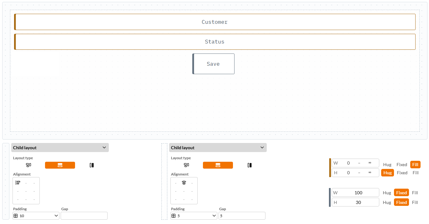
For example, consider three components placed inside a vertical stack Detail container, which sits inside a vertical stack form root. The first two components are set to Fill width and Hug height. The third component, a Button, has a Fixed width and height, and aligns to the top-center because its Detail container uses Top center alignment. Note that the other two components' alignment is not visually affected, because they fill the whole width.
Repeater - Special case
A Repeater is unusual: it has a card, drawn once per record, and an area that all those cards are laid out in. Two things to size — but only one width and height setting in the properties panel. The size mode you choose decides which of the two the setting means.
| Mode | The number sizes | Result |
|---|---|---|
Fixed |
The card |
Cards are exactly that size; the area grows to hold as many as there are. |
Hug |
The card |
Cards shrink-wrap their contents; the area follows the cards. |
Fill |
The area |
The area takes the available space and the cards divide it between them. |
So Fill is the one to use when you want a fixed number of columns that share the width of the window. Fixed and Hug are what you want when the cards have a natural size and the list should simply be as long as it needs to be.
Responsive is used to auto-fill so the cards tile themselves across the available width.
| Fill is unavailable along the direction the cards accumulate in. A Repeater that lays its cards out in rows grows downwards without limit as records arrive — so there is no fixed height to divide between them, and Fill has nothing to mean there. The option is disabled with a tooltip saying so. Change the Repeater’s direction and the disabled dimension changes with it. |
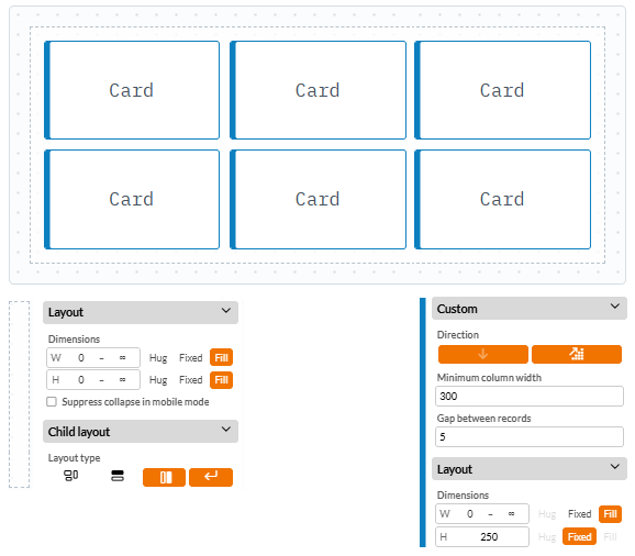
Also see the Repeater in the Form horizontal layout example.
Components
Selector, Labels, Fields, Buttons, Icons, and all elements other than the form root and containers only support Layout-Dimensions. They share the exact same sizing options and behaviors as containers.
|
Note that the option Hug, in combination with a Note field set to Display as formatted text placed on a Detail or Multi detail section, will result in an expanding Note field, meaning that this component will resize automatically as you type in it. Besides Notes, Fields are very often Fill width and Hug height. |
To understand the difference between types of dimension properties, imagine a Selector that is dropped directly onto a canvas with dimension set to 0 and "Free positioning" as Child layout. It will remain "720" pixels wide and "20" pixels high on any screen where the form is opened.
But if you wish the Selector to cover the whole width of the screen, regardless of whether you render it on a mobile or a laptop device, you must either:
-
Set dimensions in the canvas Layout, for instance, W 800 H 560, and then set Fixed edges on the Selector as "Scale - Top", or
-
Keep the canvas Layout at 0, but change its Child layout to "Stack vertically", and note how the Selector’s width is set to "720 - Fixed". Change the Fixed to Fill, to cover the whole width of the screen. See the Form vertical layout example further down in this topic.
Groups
A single stack only goes one way, and most layouts need both, for example, a column of rows, where each row is a Label beside its Field. Nesting one stack inside another is how that is built, and a Group is the container for it.
Select two or more components that share the same container, right-click, and choose Group. A Group appears in their place, holding them. It is a stack from birth — horizontal, wrapping on — so its contents sit side by side and drop to a new line when they run out of room. Change its direction, gap, padding and alignment exactly as you would any other container.
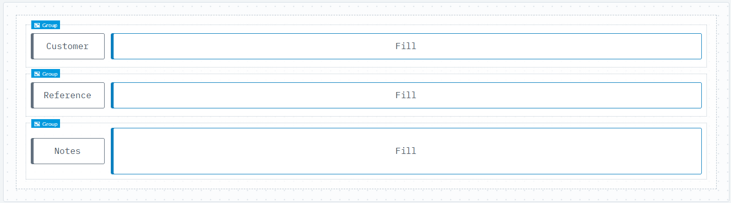
Ungroup, also on the right-click menu, dissolves it and returns the components to the parent container in the same position.
Examples
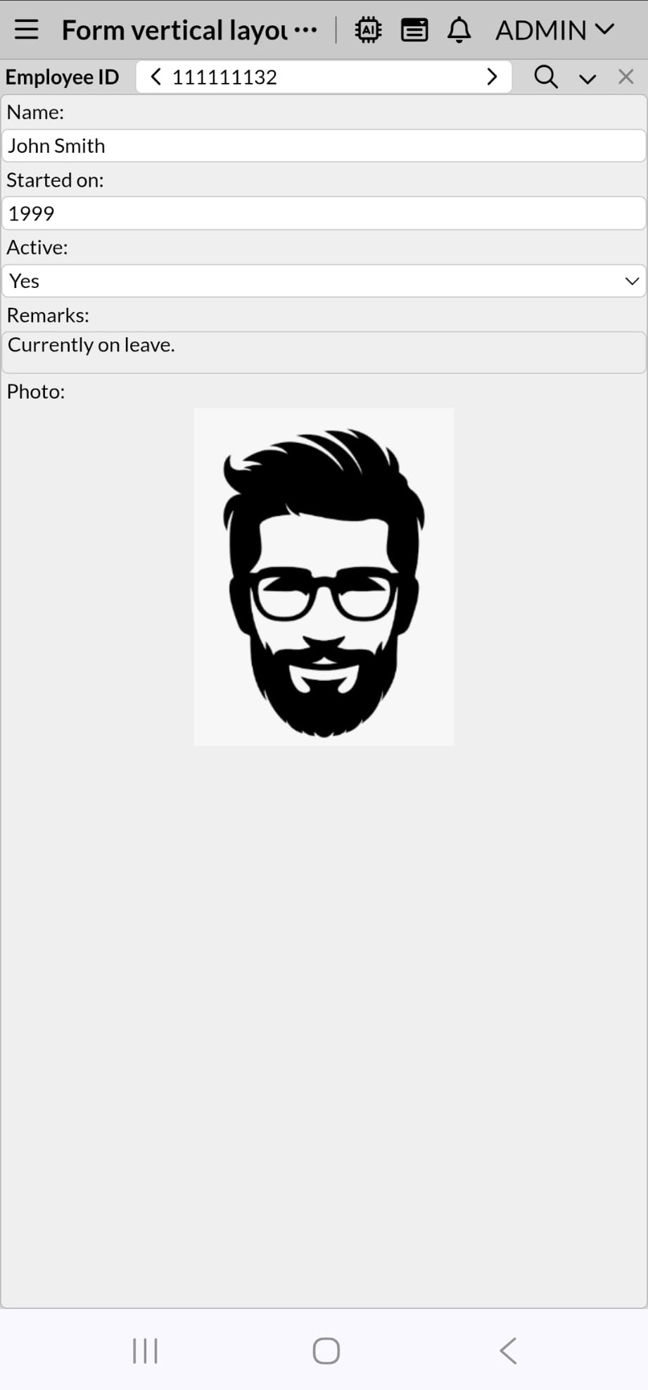
Form vertical layout
Form rendered on mobile |
Form rendered on mobile rotated |
|
|
.jpeg)
-
Select the form root, go to Layout under Properties, and keep Dimensions at 0. In Child layout, click Stack vertically.
-
Drag and drop a Label component, a Selector with Contact as Datasource, a Detail section also with Contact as Datasource, Limited by the Selector, and set its Layout with Dimensions to Fill instead of Fixed, and its Child layout as Stack vertically.
.png)
-
Add some fields to the Detail section. Select them all with the Lasso tool, and set their Layout Dimension Width to Fill, which will make them adapt to any screen size, especially looking good for a mobile device.
-
Rename the Label at the top to "Employee ID" and set its width to Fill. Also set Fill to the Selector. Now select both the Label and the Selector, right-click to group them. Note that the Group is automatically set to Stack horizontally. Adjust the height of the Group, and the width of the Label so that both fit well within the row.
-
If you like, make more groups of fields and their labels, so that they can be stacked horizontally.
.png)
Form horizontal layout
Form rendered on desktop |
|
-
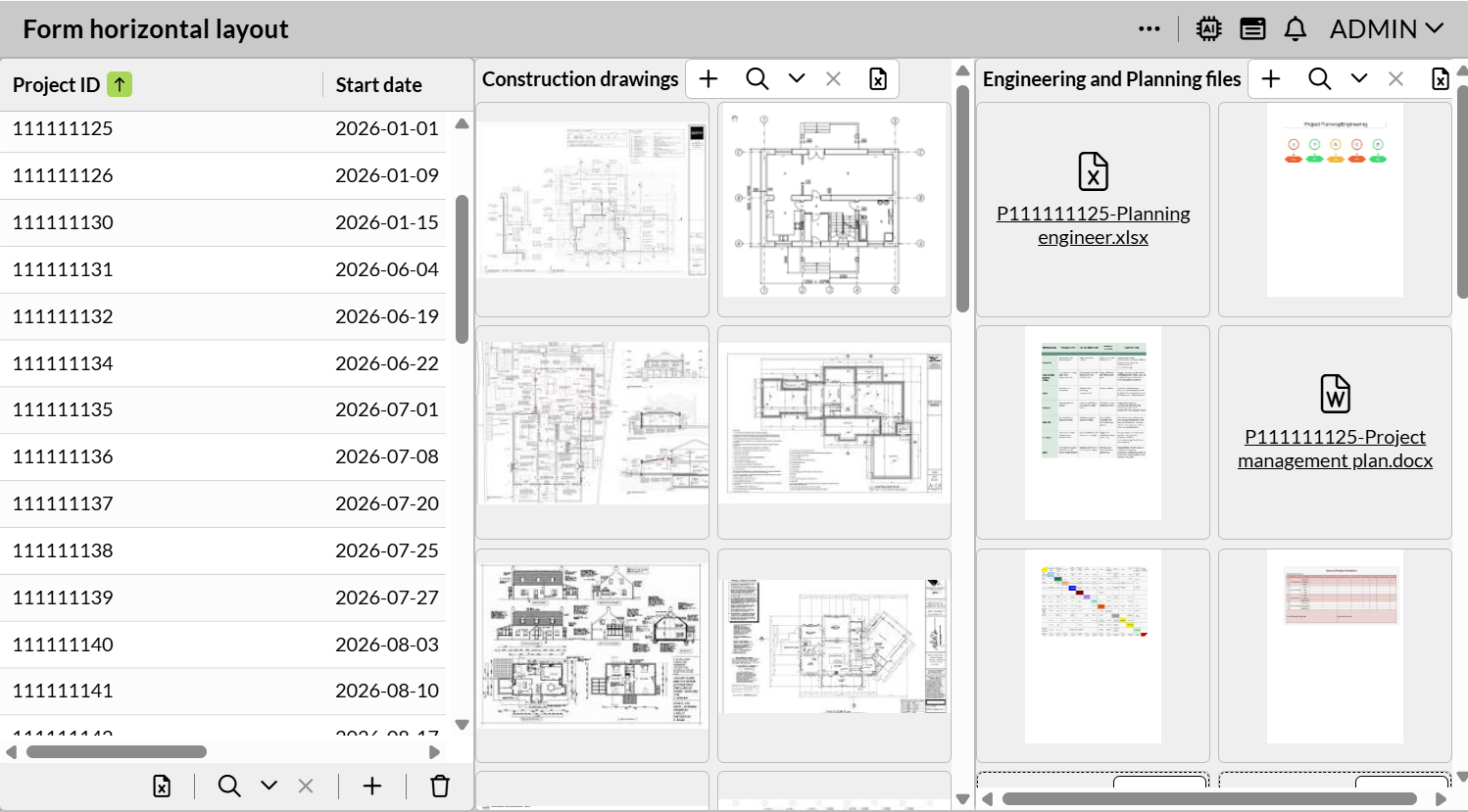
Select the form root, go to Layout under Properties, and keep Dimensions at 0. In Child layout, click Stack horizontally.
-
Drag and drop a Table section with Project as Datasource and add some fields. Then add two Panel components. Select all three items and set their width and height to Fill.
.png)
-
Select only the Panels, and set their Child layout to "Stack vertically".
-
Add a Repeater component to each Panel. Select both Repeaters. Under Custom, keep Direction set to vertical, and click the Responsive property. Under Layout set their width to Fill. Under Child layout, click Stack horizontally. Add a Media component or any field you want to display in those Repeaters.
Expanding Note field
Form rendered on desktop |
|
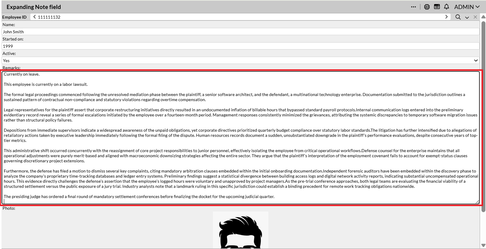
-
Select the form root, go to Layout under Properties, and keep Dimensions at 0. In Child layout, click Stack vertically.
-
Drag and drop a Multi detail section (or a Detail section with its respective Selector), set the Datasource, and set its Layout with Dimensions to Fill, and its Child layout as Stack vertically.
-
Add the Note field and other fields you need. Select the Note, select its Display as formatted text property and set its dimensions as Hug. Optionally, if you like all the fields to cover the width of the screen, set their width to Fill.
.png)
If you have other components after the Multi detail or Detail section, then you must set this section to Hug instead of Fill in step 2, so that the section can also be adjusted automatically as the Note field grows.
Remarks
-
Hiding a component closes the gap. A rule that hides a component in a stack removes it from the queue entirely and everything after it moves up. In a free-positioned container the same rule leaves a hole. This is usually what you want, and it is one of the clearest differences between the two layout types.
-
A Panel’s caption is hidden while it is stacked. On desktop, a container set to a stack does not display its caption. If you need a visible heading, add a Label as the first component in the stack instead — which also gives you full control over how it looks.
-
Tab order looks after itself. In a stack, the order you see is the order the form stores, so tabbing follows the visual order automatically. The Reset tab order action exists only for free-positioned containers, where the two can drift apart — so it is not offered here.
-
Nothing is thrown away when you switch. Going from a stack back to Free positioning freezes every component at its current on-screen position and size. Going the other way keeps each component’s size and uses the existing order. Switching back and forth to compare is safe.
-
Rules that set width or height still apply. A behaviour rule that sets a component’s width or height works on components sized Fixed — that is the mode where the number is the size. On a Hug or Fill component the size is being negotiated by the layout, so set the bounds instead, or switch the component to Fixed.
-
Work outside-in. Set the outermost container first, get its few top-level regions sizing correctly, then work down into each one. A stack can only be as flexible as the container around it, so starting with a deeply nested Panel means redoing the work once you reach the top.