Button
The button component lets customised actions to be run when it’s clicked.
Configuration
Under properties, set the Target section and optionally an icon and caption.
Under Form rules set the Behavior and Run on click, e.g.,
set :backgroundcolor = 'green'call save()|
For tables, actions will only work for the selected record. |
Example
|
Calendar
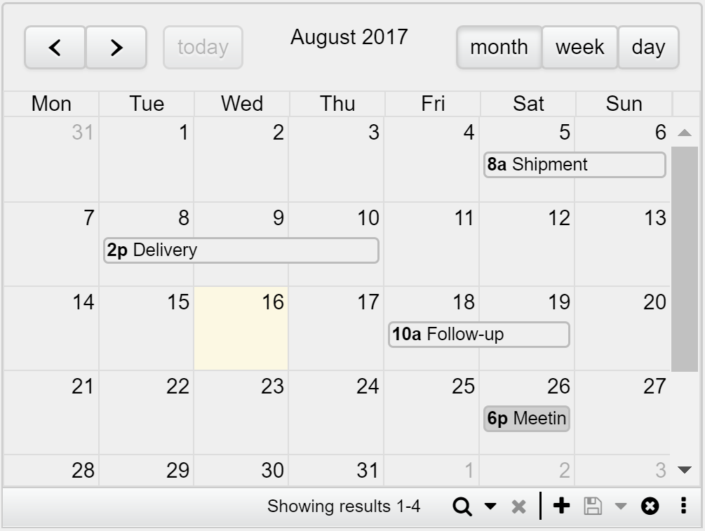
The calendar component is a full-size calendar with day, week or month-view. Toolbar buttons placement (to save, delete, add, etc.) can be aligned to the left or right to better suit your design.
Example
|
Chart
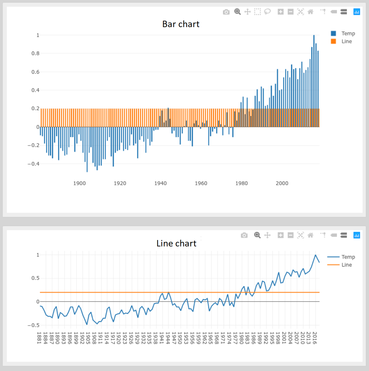
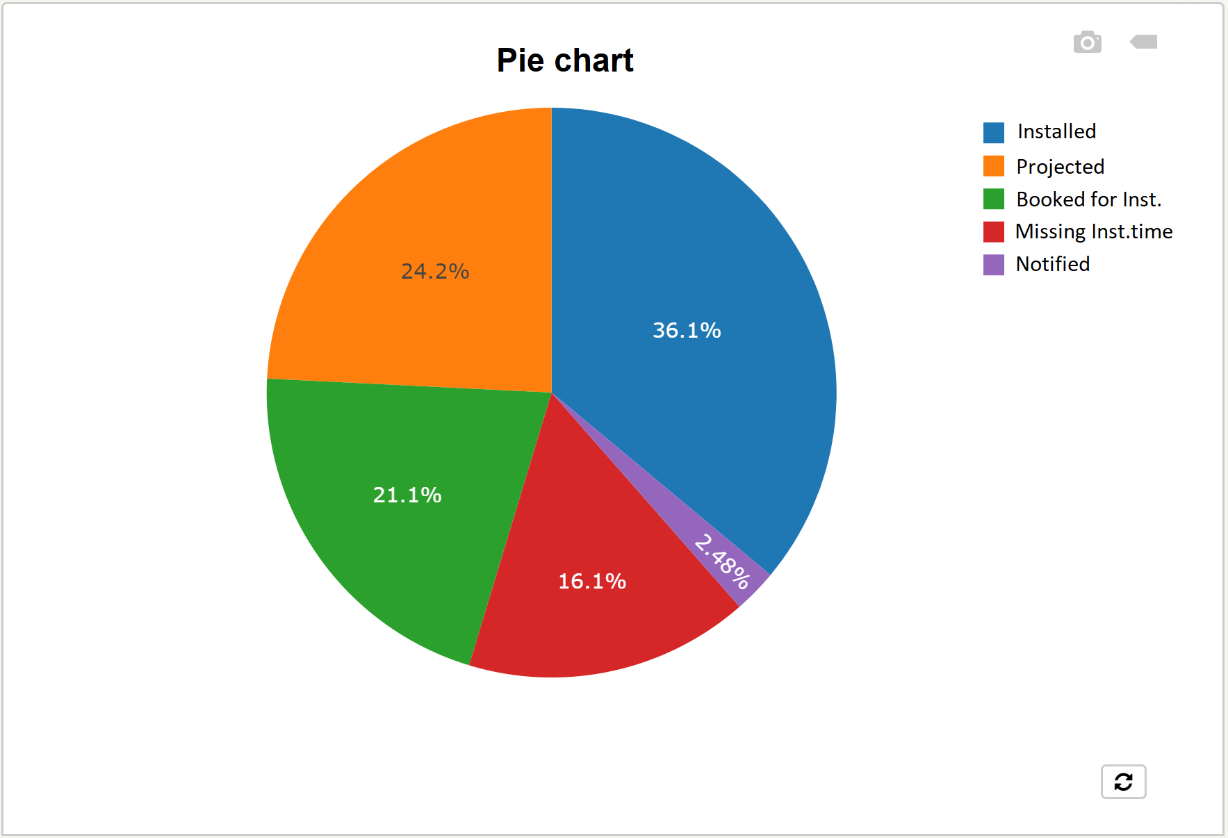
The chart component can display three different types of charts: Bar, Line and Pie charts. The chart can then be saved as a PNG with a simple click.
|
Clicking a legend hides the respective series, while double-click shows only that one. |
Example
|
|
Drawing
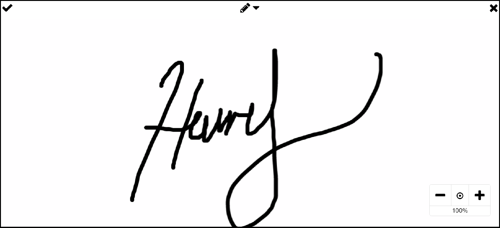
Users can sketch and add context directly onto images, PDF (first page only) and DXF CAD files, turning static visuals into interactive canvases where pins, rectangles, polygons, or lines can be drawn to highlight areas of interest, then bind information to those shapes.
Example
|
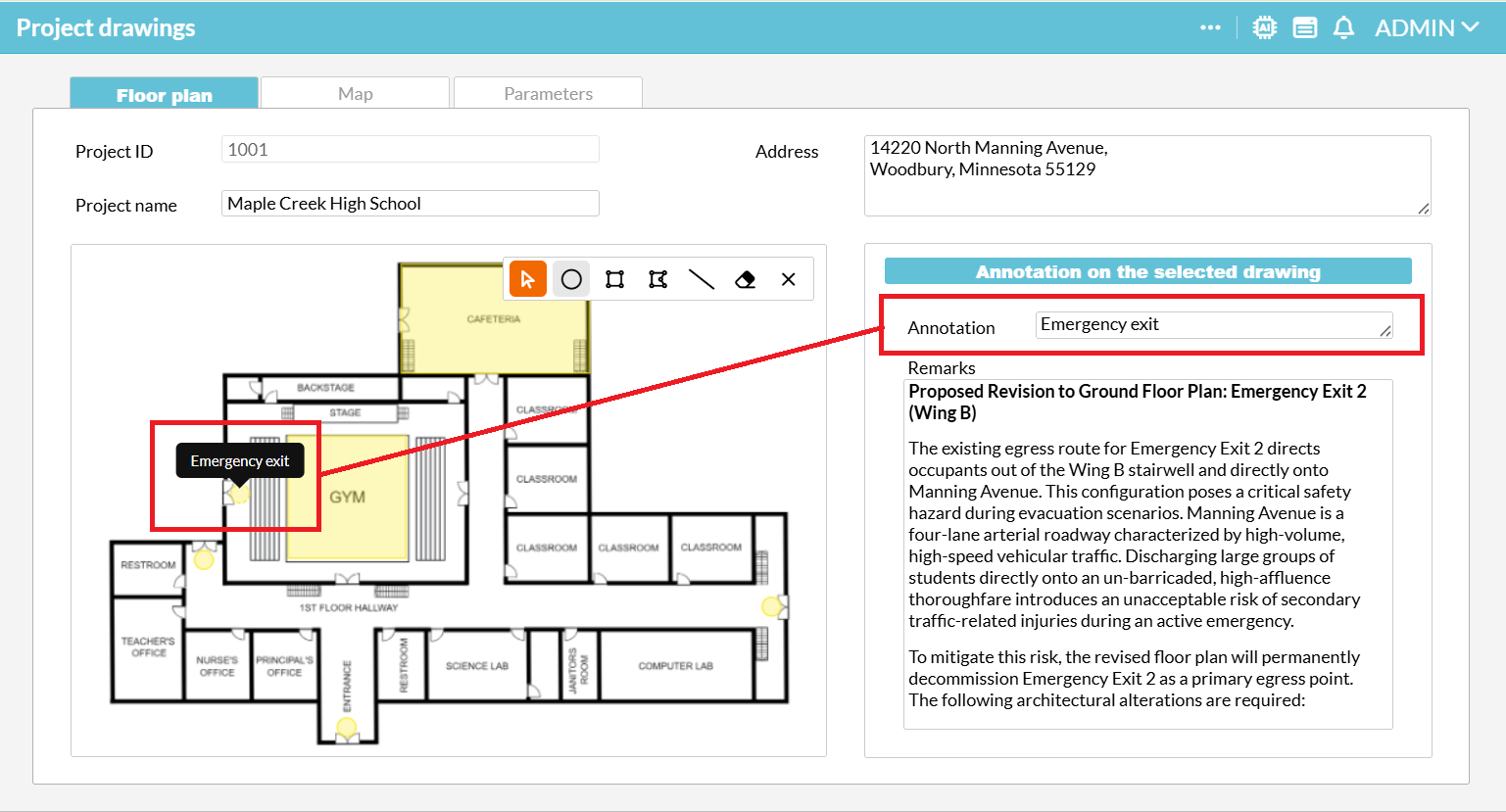
First, drop the Drawing component onto a Repeater, Detail or Multi detail section that has its Datasource set to the table containing the uploaded image or PDF file, e.g., "Project drawing".
Next, configure the component settings:
-
Background image: Set this to the proper File field.
-
Relation field: Select the Annotation settings header bar of the Drawing component and set the Relation field (e.g., from the relation "Annotation" → "Project drawing", where "Annotation" must be a Generated series).
-
Popup field: Choose the Dropdown, Text, or Note field that will serve as the tooltip when a drawing figure is selected.
-
Geometry field: Choose a Text or Note field where the shape type and drawing coordinates will be stored.
Other properties are optional.
Finally, you can add a Detail section filtered by the Drawing component. This allows users to edit the annotation in the Popup field and manage other related data.
In the rendered form, you can choose between different shapes to draw, zoom in and out, and delete selected drawings.
Gantt chart
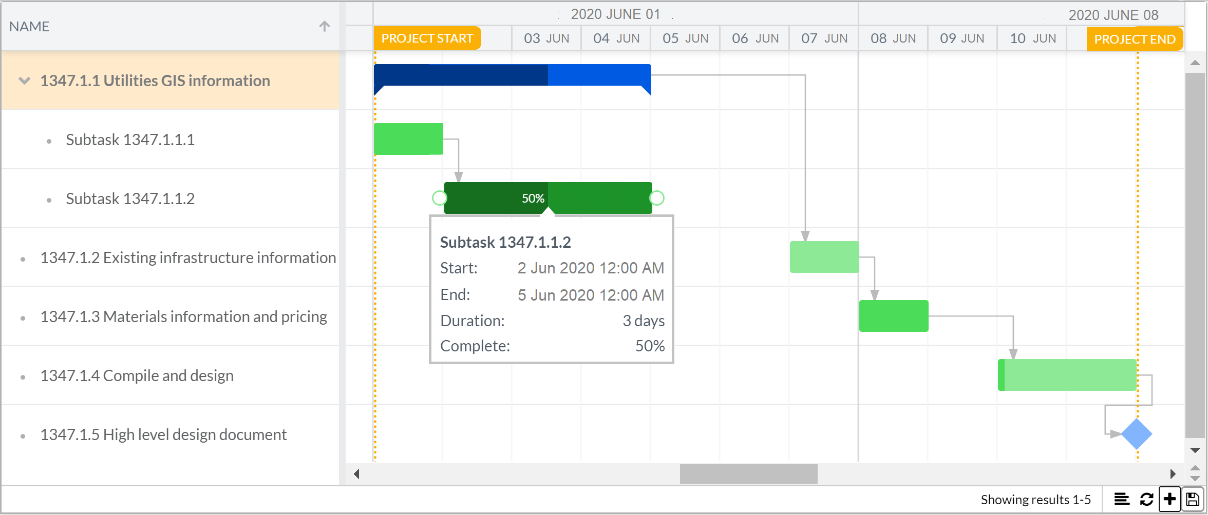
The Gantt chart component helps to schedule project tasks and tracks progress over time. Read more about the Gantt chart here.
Example
|
IQL Chart
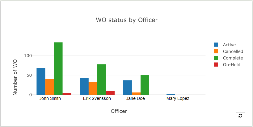
A more advanced way to configure a chart with IQL. It gives further options that is not possible in a regular chart.
Example
|
|
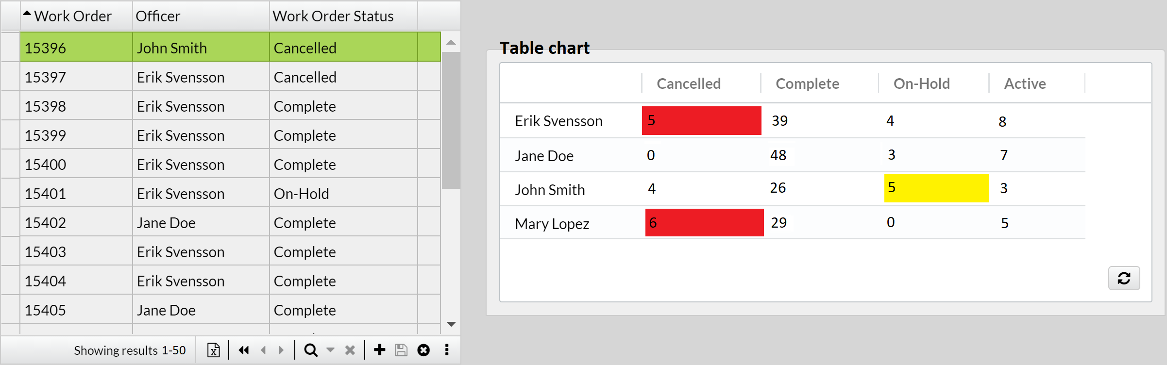
Some general properties are:
-
Show labels. This will display the original name of the field placed as x-axis at the bottom of the chart. In the image above, "Officer".
-
X-axis label. To custom the original name of the field placed as x-axis at the bottom of the chart.
-
Y-axis label. To add a name on the left side of the chart.
-
Max rows. The number of elements you want to appear on the x-axis for Line and Bar charts, or slices in Pie chart, or rows in Table chart, e.g. 3 officers.
-
Use date range selector. See an example of how it is used in Line chart. Can also be used with Bar chart. Must be used together with "X-axis type: Time series" and "Date range selector interval" properties.
Label
Text to have on the form as a legend, as a column in Table section with an IQL caption, or as a frame for embedded YouTube videos.
Example
|

Link
A link text that will take you to another form within the application, to a website or to run a report, among other actions.
|
In case this component uses Table data, but is placed outside the section, the property |
Example
|

Media
The media component may be a picture from the web, or a picture or video from a File field.
Example
|
|
|
Right-click on the rendered Media component, and click "Copy link address". Example of the link obtained: Then you can share the link with members of the application (e.g., via mail, notification or SMS) to automatically download the file, provided they have the appropriate access rights. |
Map
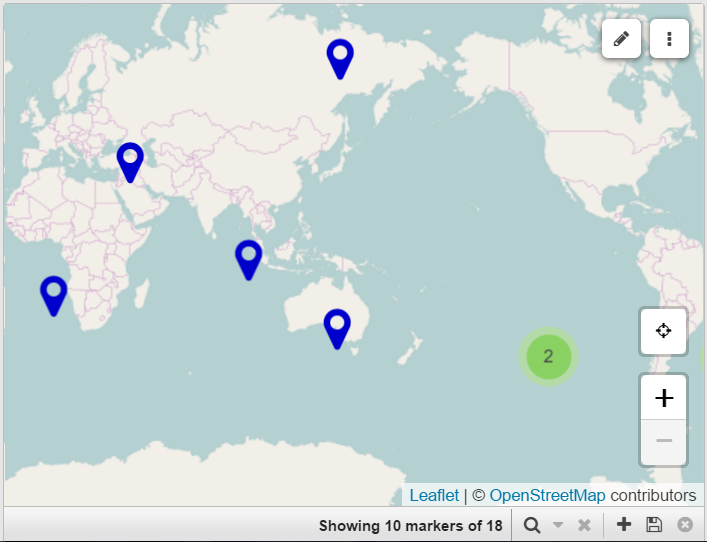
The map component is a map where coordinates can be marked to identify the location referred by a record. Toolbar buttons placement (to save, delete, add, etc.) can be aligned to the left or right to better suit your design.
Example
|
Map layer
Additional layers of location markers can be overlaid onto a Map component. It’s makes it possible to display data from a GeoJson field.
Map layer editor
A layer overlaid onto a Map component that includes tools to draw areas or edit existing ones. It’s makes it possible to store GeoJson data in a note field.
Meter
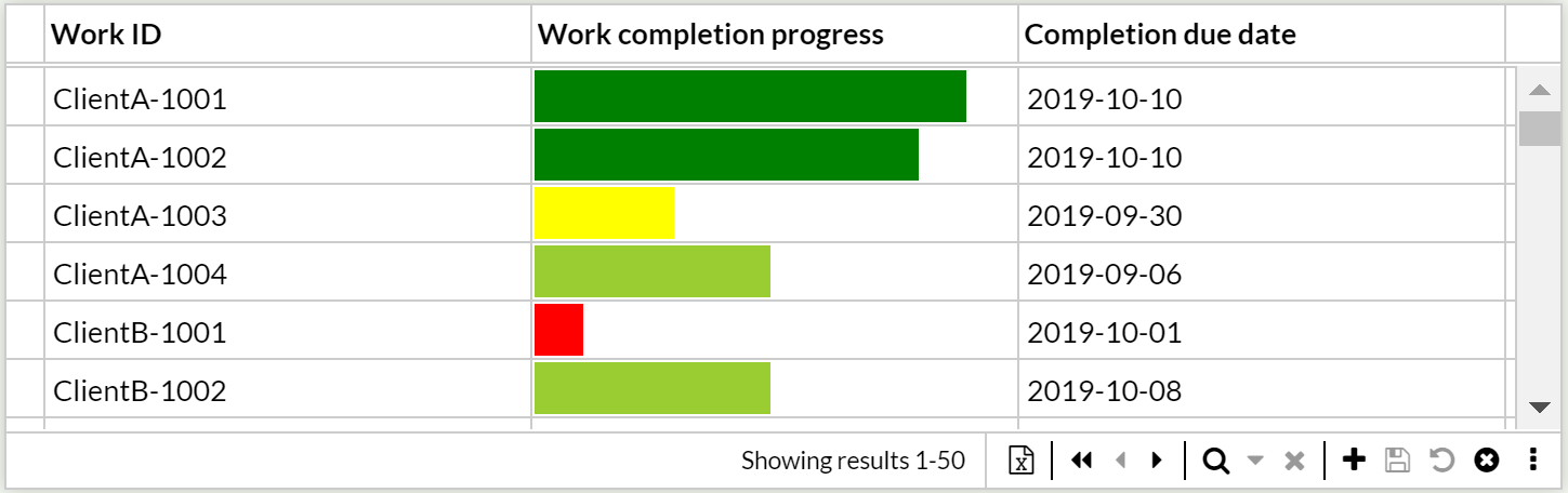
The meter component is a tool to display a number field as a portion of an interval, e.g., exceptional for displaying progress.
|
Set the color of the bar depending on the value. E.g., |
|
Hoovering over the bar displays the exact value. |
Example
|
Search box
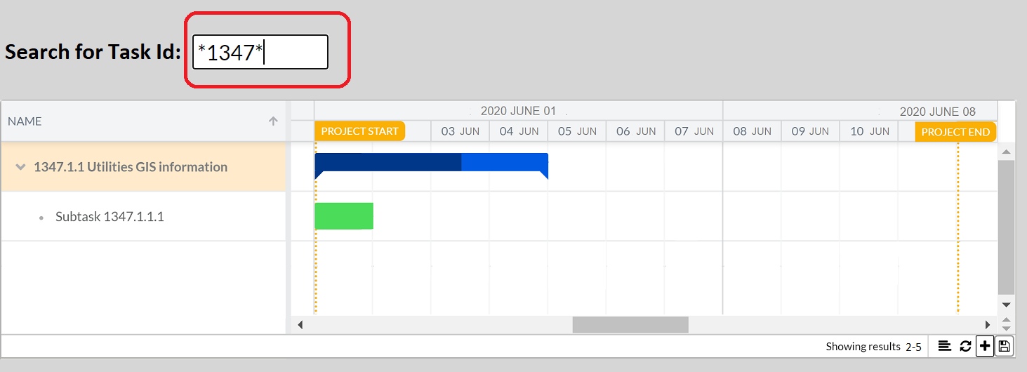
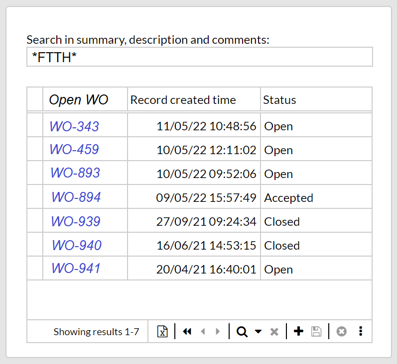
The search box is an input box to search data. It is configured in the following steps.
-
Add an input field to the canvas, e.g., Text or Number field.
-
Under Properties, set Datasource to a desired variable, e.g.,
@searchForNames.
-
-
Add a Section that displays records, e.g., a Table or a Repeater section.
-
Under Form rules, set the filter to display the records that matches the variable. E.g.,
Name contains @SearchForNames
-
A simple search box is thereby made.
Example
|
|
Rectangle
The Rectangle component is used for highlighting an area of the form.
Custom the rectangle’s color, transparency and behavior as wished.
|
The Rectangle component is not rendered in mobile mode. |
3D Viewer
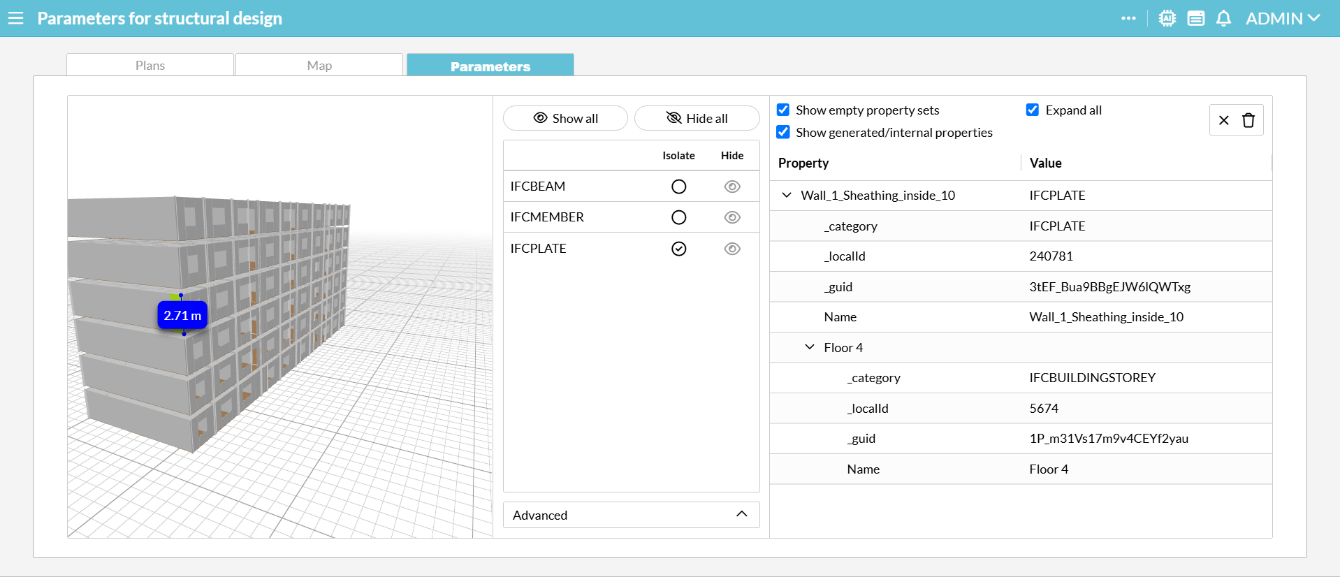
View 3D models directly in your form. It supports architectural BIM data (IFC), web graphics (GLB/GLTF) and 3D printing files (STL/3MF/OBJ).
Example
|
First, drop the 3D Viewer component onto a Repeater, Detail or Multi detail section that has its Datasource set to the table containing the uploaded file.
Next, configure the component settings:
-
File field: Set this to the proper File field.
-
Selection parameter: Optional. When visual elements in an IFC or common 3D file are selected, their geometry metadata is automatically retrieved into this parameter. This allows administrators to utilize JSONPath expressions to use the 3D Viewer as a selector or to selectively query, filter, and populate relational data tables.
Other properties are optional.
In the rendered component, you can use its tools to show and hide elements or an advanced filter, and review its properties.